From childcare to broadcasting on First Hill:
A look at Cascade PBS’s new headquarters
By EMMA HINCHLIFFE
A/E Editor
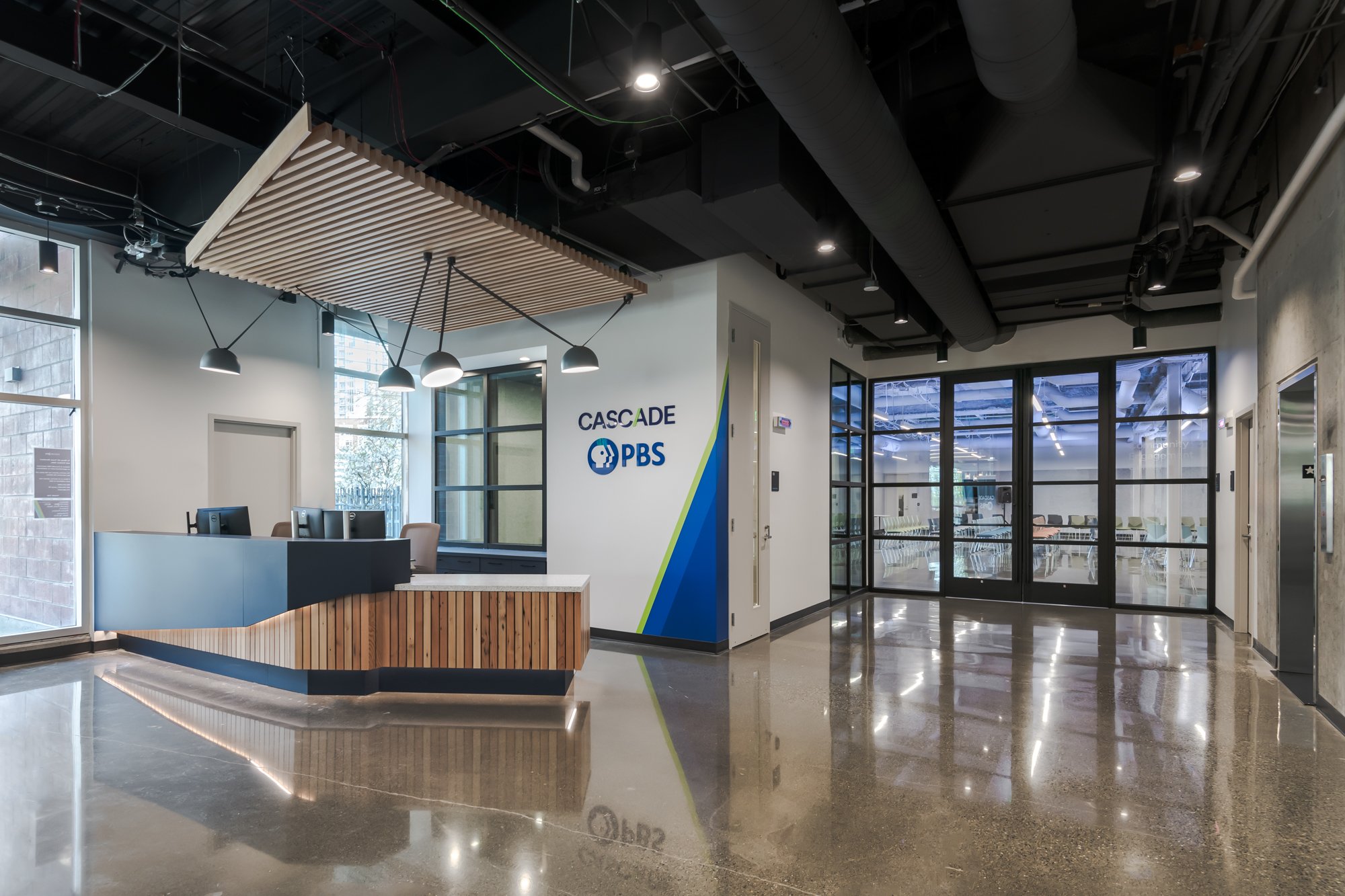
Published in the Daily Journal of Commerce may 8, 2024The building’s ground floor has a welcoming lobby that leads to a large events space.
Photos by Pamela Bolig
The headquarters’ aesthetic mixes industrial and organic elements.
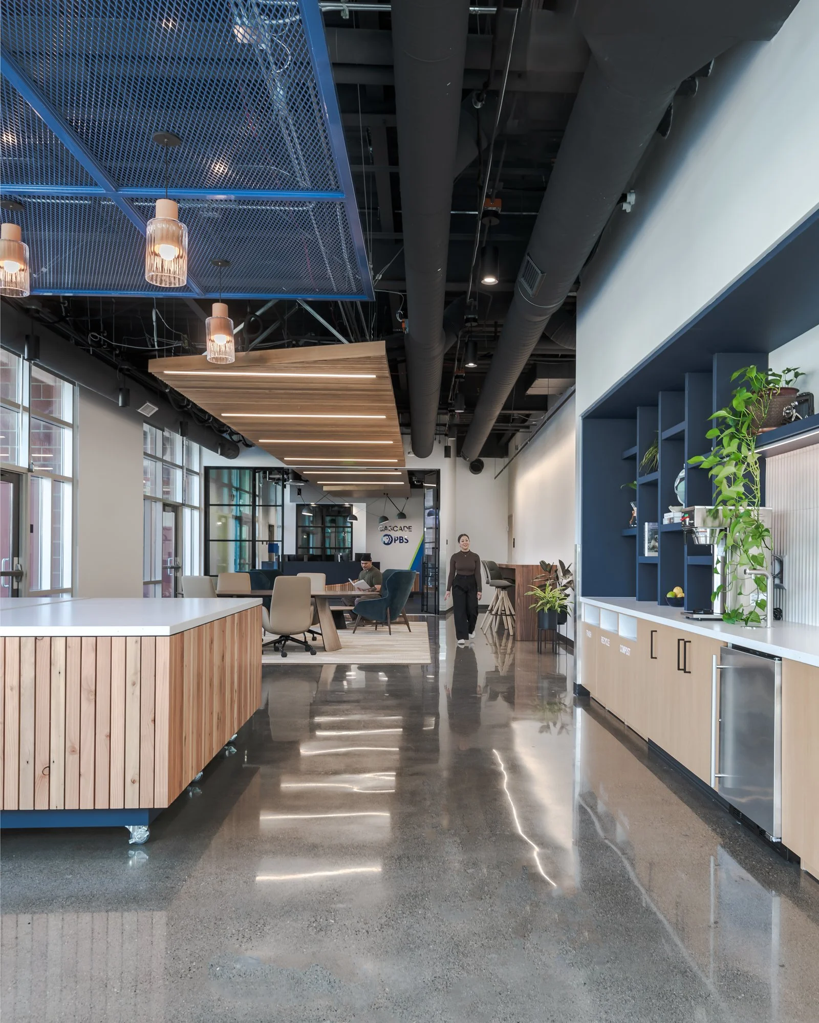
Workspaces include two ‘hoteling’ lounges.
After more than 40 years at Seattle Center, in January Cascade PBS - the new unified name for nonprofit media outlets KCTS 9 TV and Crosscut.com - moved into a new headquarters on First Hill. The building, at 316 Broadway, was previously the headquarters for nonprofit Childhaven which provides therapeutic services for children aged 0–13 who have experienced trauma and neglect.
Cascade Public Media, the parent company for Cascade PBS, purchased the property in 2022. It had been purpose-built for Childhaven in 2004 and comprised a mix of office, classroom, clinic, and support areas, including at one time a 24-hour crisis nursery.
Classrooms have now given way to state-of-the-art production spaces; dated office floors have been transformed into modern work areas; and a building that once served local families now serves the community in a different fashion via a new 240-seat events space on the ground level which will be used to host Cascade PBS events and is also available to community and partner organizations.
JPC Architects of Bellevue was tapped to lead the extensive transformation of the building. Abbott Construction was the general contractor. The tenant improvements took approximately one year to complete.
The new headquarters is around 35,000 square feet across three floors plus approximately 10,000 square feet of outdoor space. The building has a fourth floor which was not part of the project scope. The intent is that Cascade PBS could expand into this floor in the future, or they could lease it to another tenant. There is also a parking garage below the building. Work there included upgraded lighting, new bike parking, EV chargers, and some structural reinforcement.
The ground floor, which was previously majority classrooms and support space, has seen the biggest changes. “The programming and spaces on this level were pretty much wiped,” Jorgen Graff, project architect at JPC told the DJC.
The ground floor is now public facing with a modern lobby that leads to the large flexible events space. On the other side of the lobby is a ‘pre-function room' that can also be used to host smaller events or as an extension of the larger space.
Cascade PBS will also use the ground floor for production. This level includes a studio with green screen capabilities, a green room for visiting guests/presenters, and a podcast studio. In addition, the events area will be kitted out with specialty grade lighting and is soundproofed so it can easily double as studio space.
The podcast studio is surrounded by glass and is one of the first things guests see as they enter the building. “This placement was really important as it immediately signals that the building is now home to a media organization and gives the public a glimpse at the work happening here,” Amy Colby, associate at JPC Architects explained.
Colby added that having a ground level partly committed to community use was imperative for Cascade PBS because it represents the company's commitment to serve the community and tell its stories, as well as the fact that it is a publicly supported media organization.
The community also played a significant role in making the new headquarters a reality. Over 4,000 donors contributed to a capital campaign for the project, which the broadcaster says was the largest in its history. The names of some of those donors are inscribed on pavers in a new patio area adjacent to the pre-function room.
“It was really wonderful to be able to physically commemorate the community's support for this project in the patio,” Graff said.
The building's second and third floors were previously used as office space for Childhaven. That basic use remains the same, but the work environment has been significantly upgraded to support a variety of working styles and accommodate media-specific workspaces and needs.
Specialty spaces include editing rooms and a master control room. Thoughtful amenities include a wellness room and a parents' room. A highlight, and one of Graff's favorite spaces in the building, is an approximately 6,000-square-foot outdoor deck on level two. This space can be used to host community events but is primarily an amenity for employees. It was previously a children's play area. The architects removed existing play equipment (which was subsequently donated) and synthetic turf and replaced it with a mix of pavers and decking. On a clear day the deck has great views of the city and Mount Rainier.
At the old Seattle Center office Cascade PBS employees typically worked in 80s-style cubicles. Now they have a diverse range of workspaces to choose from including open-plan office areas, private rooms and two ‘hoteling' lounges with residential-style furnishings. There is a hoteling lounge on both the second and third floors of the building. The second-level lounge leads directly to the deck amenity.
Colby said it was important that the new office complemented employees' hybrid work schedules and reflected the diversity of working styles that have come to prominence since the covid-19 pandemic.
The office also has a variety of meeting spaces and rooms.
Graff and Colby described the headquarters' aesthetic as “clean and comfortable.” Interior design is inspired by the natural environment of the Pacific Northwest. There is a mix of industrial and organic elements, such as polished concrete floors and wood furnishings, and lots of white, blue, stone, and green tones. Areas have also been laid out to provide employees with as much access to natural light as possible.
The project is targeting LEED Silver certification.
While the change of use was pretty significant, Graff said some elements of the existing space actually lent themselves surprisingly well to the building's new purpose. For example, because the property originally housed childcare space it had a high fire safety rating which was also needed for its new use as events space. Moreover, the ground level included some outside play areas for children which are now used as outside space for events and gatherings.
Nevertheless, as with any significant change of use there were some interesting design challenges for the team to solve. One of the biggest was ensuring that elements of the building were appropriately soundproofed for broadcasting. For the podcast studio this meant installing new walls that are nearly 12-inches thick.
Another challenge came when opening up the ground level for events. The existing space had two structural columns which Cascade PBS wanted to remove. To make up for the structural support lost by the removal, the team had to add a 4-foot beam to the ceiling.
Colby and Graff said the feedback they have received on the space from employees has been great.
“The goal was to give Cascade PBS a home for the next 40 years that could evolve with them over time, and I think we have successfully achieved that,” Colby concluded.
The project team also included OAC Services, construction manager; Lund Opsahl, structural engineer; GCH Planning and Landscape Architecture, landscape architect; A3 Acoustics, acoustical engineer; and Projex, furniture.

Adventure and curiosity inspire design of new Bellevue pediatric dental clinic
By EMMA HINCHLIFFE
A/E Editor
Published in the Daily Journal of Commerce FEBRUARY 8, 2023The front desk is designed to encourage children to come-up and check themselves in.
Photo by Cleary O’Farrell Photography
The waiting room is named base camp and has adventure themed decor and furnishings.
Photo by Cleary O’Farrell Photography
Each treatment bay is named after a national park. The Rainier chair is pictured.
Photo by Cleary O’Farrell Photography
For many readers, childhood memories of the dentist might bring up fear more than fun, but at the recently opened Expedition Pediatric Dentistry in Bellevue Dr. Megan Miller is on a mission to change that. At Dr. Miller's new clinic, patients are invited to embark on an adventure as they take their first steps on their oral health journey in a space thoughtfully designed to spark a sense of adventure and curiosity.
JPC Architects worked closely with Dr. Miller on the design of her new practice which is in the Park Heights Building at 1800 117th Ave. N.E., Suite 302, in Bellevue. The 1,915-square-foot space was previously a generic looking office. Now it is a bright and light dental clinic with three open treatment bays, two private operatories, a specific room for treating babies, a check in area, waiting room, and staff room and spaces.
The design and vision for the clinic was heavily influenced by child psychology research which has shown that open-ended play helps children tap into their imagination and develop independence. “I wanted to create a clinic that was functional and felt good to work in for myself and my team, but more than anything I wanted the space to feel welcoming to everyone and to be a place where children had agency and were encouraged to investigate the space and world around them,” Dr. Miller shared.
An adventure and exploration theme infuses the space. Patients begin their visit at the front desk which has a one-of-a-kind rope feature wall designed by JPC Architects to highlight Expedition Dentistry's handcrafted logo. After checking in, patients move to “base camp” i.e. the waiting room which is filled with adventure themed toys and furnishings including a tepee. Continuing the theme, treatment bays are each named for a different national park (such as the Rainier chair or the Zion chair) and are decorated with related images and maps.
Patients are inspired to explore and take control of their visit from the get go. The clinic's custom-made check-in desk is multi-height with a lower section in the middle to encourage kids to approach and check themselves in. The door which leads from the check-in desk to base camp also has a smaller door cut-out within it, designed especially for kids to walk through. Once patients get to their park themed bay they will also find more of what the design team calls ‘Easter eggs' to explore. These include a child-height chalk board with their name written on and exhibit cubes embedded into custom cabinets not unlike those you might expect to find in an aquarium. Unique flat lying purple chairs were also chosen for the treatment bays as they can easily be climbed up on by kids.
Unlike many child focused spaces, Expedition Dentistry feels bright and playful but does not fall into the trap of becoming garish or cartoonish, and is a place where both children and adults can feel comfortable. The clinic's color and materials palette is inspired by the outdoors and natural environment of the PNW with lots of wood furniture and finishes and sea-foam greens, whites, grays and blues, juxtaposed with pops of purple. “I wanted colors that made the space feel happy but that also promoted calm and did not overstimulate,” Dr. Miller said. Furniture is streamlined which adds to that sense of calm. Lots of attention was also paid to lighting design. The treatment bay area has up-lighting and lights that can be dimmed depending on the patient's preference.
“Everything you see in this space has an intention and reason behind it,” Christine Benda, associate and Healthcare Studio lead at JPC Architects, shared. “This isn't just a space that looks nice, but one that has been designed to have a positive impact on patients and staff.” “We pretty much gutted the existing space,” she continued, “Apart from keeping some existing features of the core and shell that really enhanced the design concept.” Those features include original wooden doors and exposed structural wood beams.
These biophilic elements add to the adventure theme and also help tie the clinic to its surrounding environment. The clinic is located in an area surrounded by trees and patient spaces have large windows that connect them to the outside environment. “The surrounding nature was a major reason I decided to open my practice here,” Dr. Miller shared.
Construction began on the new space in May 2021 and the clinic opened in January 2022. Big Sky Northwest was the general contractor.
“I'm so happy with how the space turned out, I feel like it is a true embodiment of me and how I see my role as the child's first dentist - to be a guide on their health journey,” Dr. Miller concluded.

JPC Architects brings some magic and mystery to its latest office project
By EMMA HINCHLIFE
A/E Editor
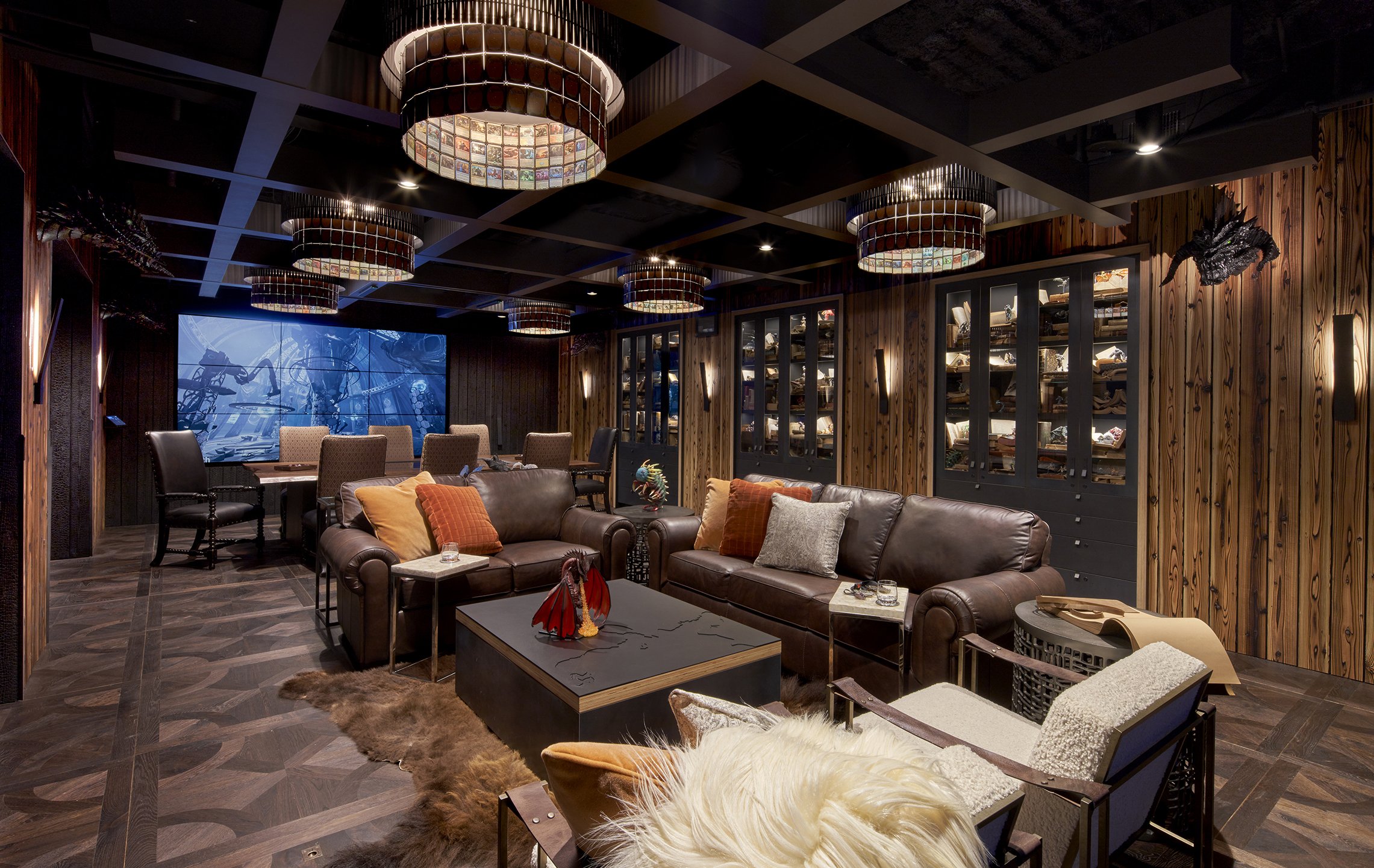
Published in the Daily Journal of Commerce june 1, 2022Gandalf or Merlin would feel right at home in the whimsical game room.
Photo by Chris Eden Photography
Other parts of the office have also been upgraded.
Photo courtesy of Venture General Contracting
Stepping into the new game room at game developer Wizards of the Coast's new offices in Eastgate, you might feel as if you've walked onto the set of a fantasy film. Dragon heads are mounted on the wall, jars contain mythical ‘pests' from the company's Magic: The Gathering card game, bookshelves are filled with magical tomes and spell books and there is even a virtual trap door within a custom made dark wood floor.
The 750-square-foot room is part of a bigger 28,000-square-foot tenant improvement project at the company's new offices at Eastgate Office Park (15325 S.E 30th Pl., Bellevue).
JPC Architects worked closely with Wizards of the Coast to create a space that reflected the “creative nature of Wizards' products.” This translates to immersive fantasy features and a sprinkling of magic and mystery. The game room is the centerpiece of the new office. It includes a custom-made games table and is stocked with hundreds of company branded figurines and games. There is also custom flooring, casework/wood paneling, and six custom created light fixtures that incorporate Wizards' trademark game cards. The space has a metal and wood materiality which JPC says gives it a “sophisticated and cozy feel.”
The games room also incorporates audio-visual technology that brings the magic of the Wizards' brand to life. The custom live-edge gaming table has a 50” screen integrated into the top along with custom-built drawers for game pieces. It also has LED illumination when spells are cast during a game and when people approach certain areas of the game room, or open drawers in the custom casework, audio clips play. “This gaming room provides the perfect environment for an imaginative Dungeon Master to lead a campaign of Dungeons and Dragons on a custom game table, or challenge an opponent in a video game that can be cast to any of several screen walls in the room. The ambiance is simultaneously classy and whimsical,” JPC said.
Other parts of the office, which consists of a large boardroom, private offices, a kitchenette and a mix of formal and informal seating areas for communal or more focused work, look more traditional. Renovations included lobby modifications, the addition of private offices at both ends of the floor, a kitchenette refresh, and restroom modifications. However, there is still an air of magic as you enter the space to be greeted by a life-size figure from one of the company's games.
The project took twelve months to complete and the office opened in January 2022. Venture was the general contractor. “JPC has designed spaces for Wizards of the Coast for over 20 years. Because of this long-standing relationship, we have a deep understanding of the roots and evolution of the company. We were able to go deep in this project, explore lots of possibilities, and make many of them a reality for Wizards. Thus, allowing JPC to fully express the interests of the company. It is a small space, packed with design details,” JPC added.
The design team for the project includes: Graypants (Pacific Lighting Systems), light fixtures; Volpin, Dragonhead and Strixhaven pest props; Tempest AV, AV design and install; Meyer Wells (now part of Coriander Designs), custom gaming table; WWWells & JMI, millwork and metal work; Miniature Market, miniature figurines; Books by the Foot, book accessories; Nakamoto Forestry, sugi ban and Duchateau, flooring.

DreamBox Learning's new headquarters brings the company's online world into the office
By EMMA HINCHLIFE
A/E Editor
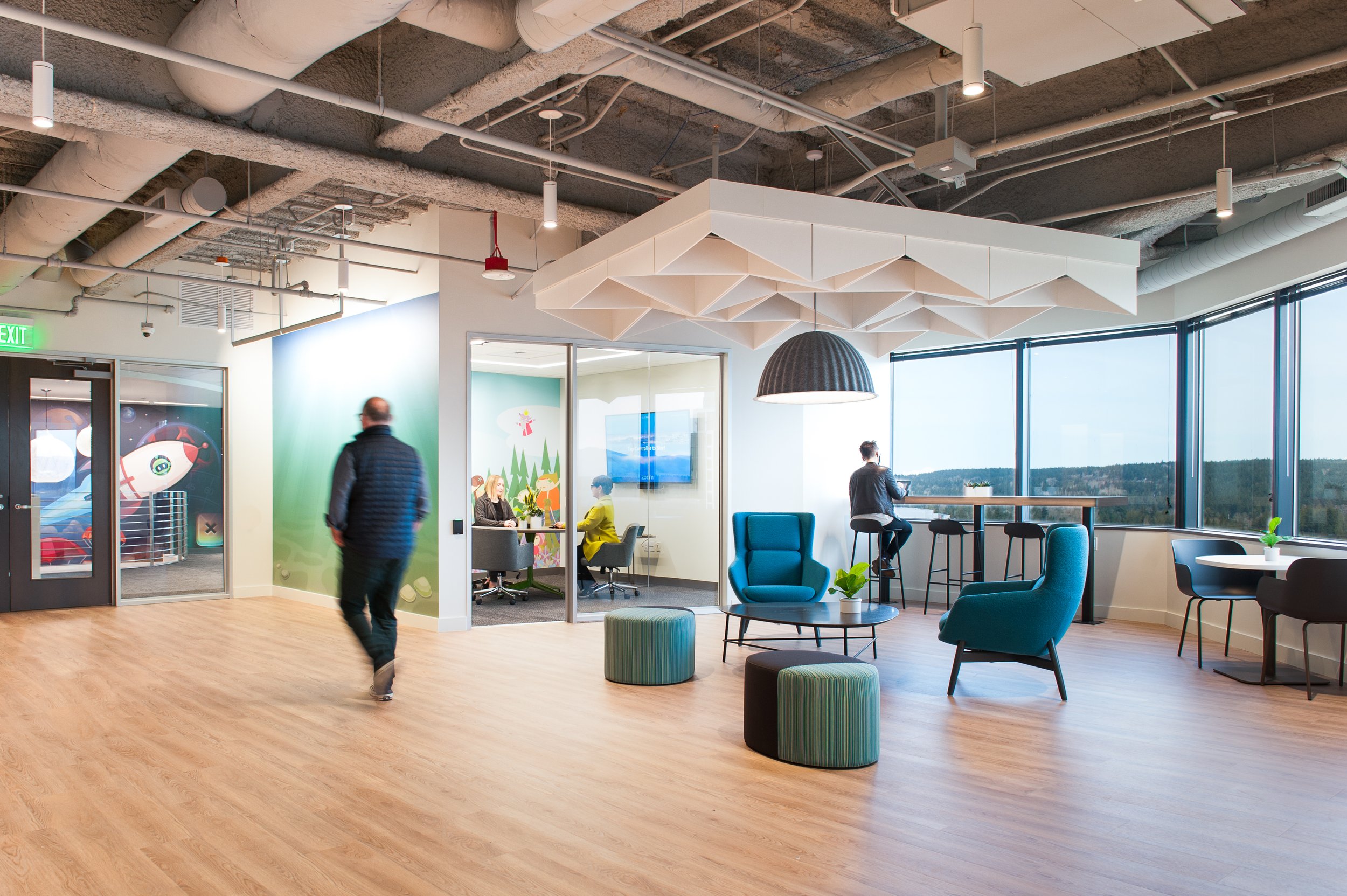
Published in the Daily Journal of Commerce Feb 17, 2022Murals in the building were produced by Dreambox in collaboration with project architect Pam Bolig.
Photo by Pam Bolig Photography
The redesign took just under a year to complete.
Photo by Pam Bolig Photography
In late 2019, DreamBox Learning, a K-12 education technology provider that offers adaptive mathematics and reading learning solutions, teamed up with JPC Architects to design and redevelop the company's new headquarters in downtown Bellevue's Symetra Tower.
The 27,700-square-foot tenant improvement project included a full demolition and interior finish refresh to one and a half floors connected by an interstitial staircase. The redeveloped space includes a hybrid of heads-down vs. collaborative spaces with phone booths, huddle rooms, conference rooms, breakout areas, open work areas, and "creativity zones." There is also unique art work, contemporary LED light fixtures and turf baffle ceiling assemblies.
The project came about after DreamBox saw significant growth and its old offices became too small. With a new office came the opportunity to create a work environment more in tune with the company's culture and branding and an environment that better suited its workflow. “The new offices needed to be adaptive to balance DreamBox's collaborative work process with their focused analytical work. Space planning involved creating several tiers of spaces that can flex, serving larger group collaborations as well as single users in quieter zones,” JPC Architects shared. “They also needed a space with a better flow based on how their departments worked together and the space needed to better suit the needs of the individual departments.”
The result is a fun, bright, creative and friendly space. “The redesign is youthful, festive and optimistic,” the architects continued. “DreamBox wanted their online world to be realized in a real space to serve as a reminder of what they are working for. They wanted to create a fun space that reminded who they were serving, but not seem like a 'kids' zone.'” Branded art and graphics are thoughtfully placed in the space including a striking two-story mural in the stairwell.
Spaces were designed for graphics to live in instead of finding a place for them as an afterthought, which DreamBox and JPC says was more the case in the old office.
The office also includes artwork by JPC project architect Pam Bolig. The team at DreamBox noticed some of Bolig's artworks in the background of a zoom call and thought they would be great for the space. “Bolig's dreamscapes artwork connected very well with the company's online learning environment and making artwork fun in a welcoming environment,” DreamBox said.
Construction began on the project in May 2020 and was completed in March 2021 with Foushée as the general contractor. The pandemic had an effect on the final design as all conference rooms and offices are Zoom-ready for push button meetings with appropriate A/V to enable remote team members to feel more present. JPC also developed spaces where people can come in and have quick dropdown/touchdown spaces. Breakout areas are also designed to be calm and soothing with the aid of felt and acoustic treatments.


