Merriman
18,000 sf | seattle, WAMAINTAINING A SENSE OF OPENNESS.
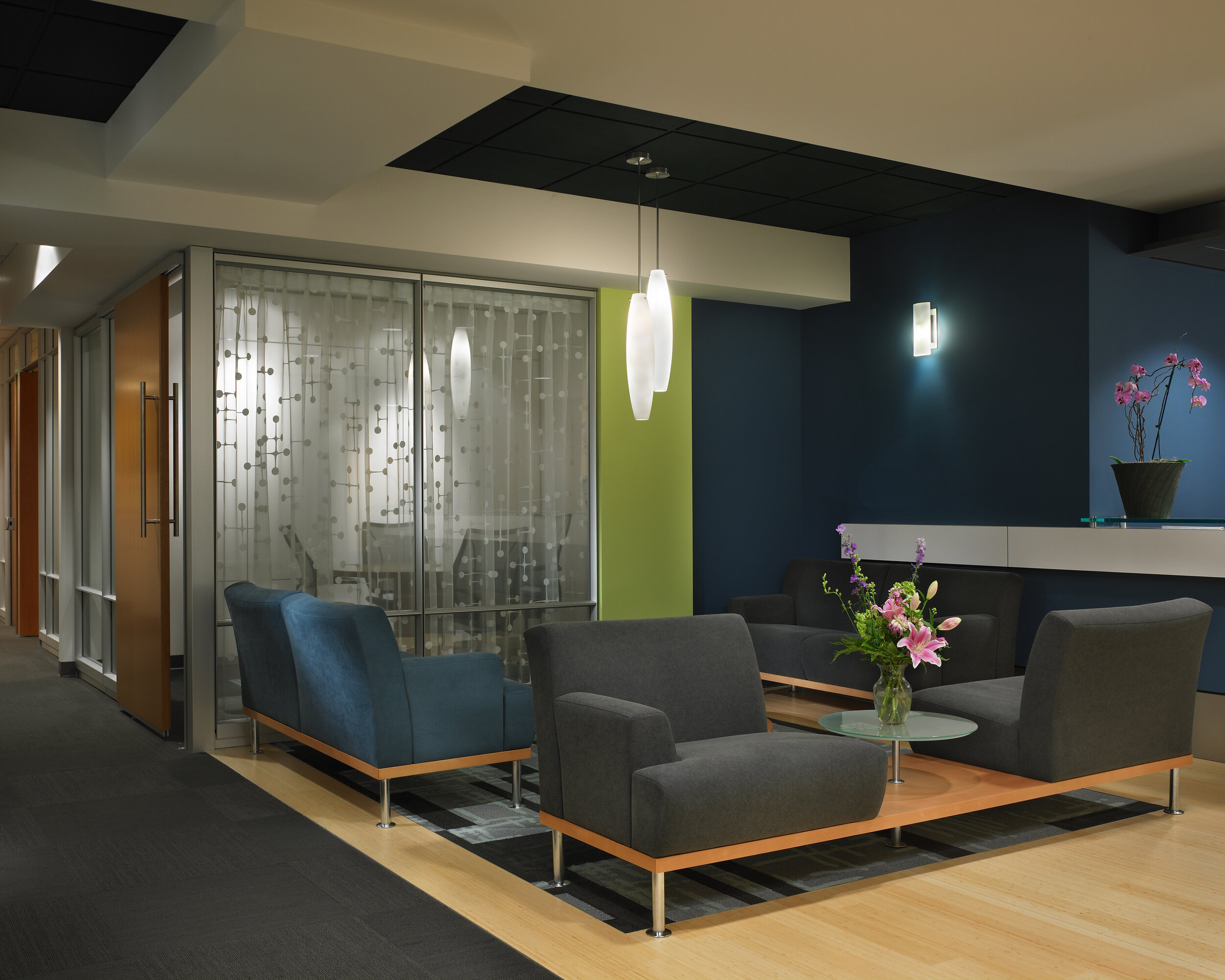
Merriman Berkman Next was an 18,000 sf tenant improvement. Part way through this project, the firm’s name changed from Merriman Capital to Merriman Berkman Next as two existing firms merged into a newly formed company. The “Next” part of the name is part of the new company’s branding strategy, posing the question, “What’s next?”. This created interesting drivers for the design. Corners and passages became design elements inviting the visitor to be curious about what’s around the corner. The client wanted the space to give the impression that the firm’s principals and associates are fun and approachable while at the same time solid, concerned professionals. Patterns, colors and textures used throughout the design accomplished this request. The client had a plan for 50/50 private office vs. workstations and wanted to maintain a sense of openness in the space. A wall system was chosen for the offices with plenty of glazing to preserve the view (from the 29th floor) for all employees.
BENJAMIN BENSCHNEIDER PHOTOGRAPHY


