Affinity Dental
1,260 sf | edmonds, waPOLISHED AND SOPHISTICATED.
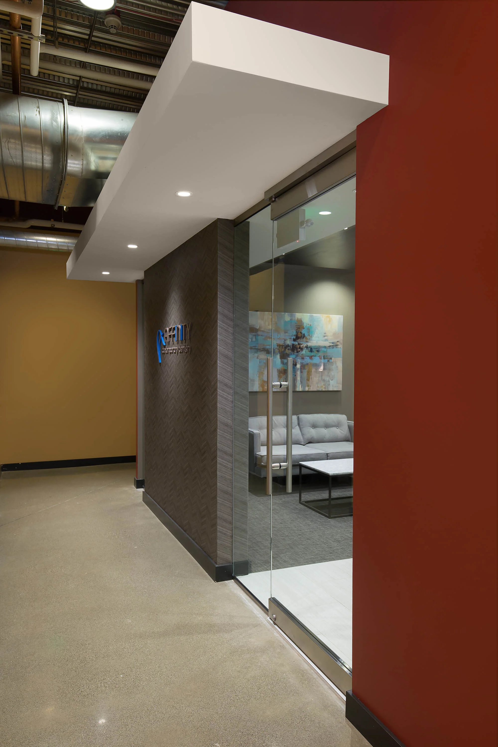
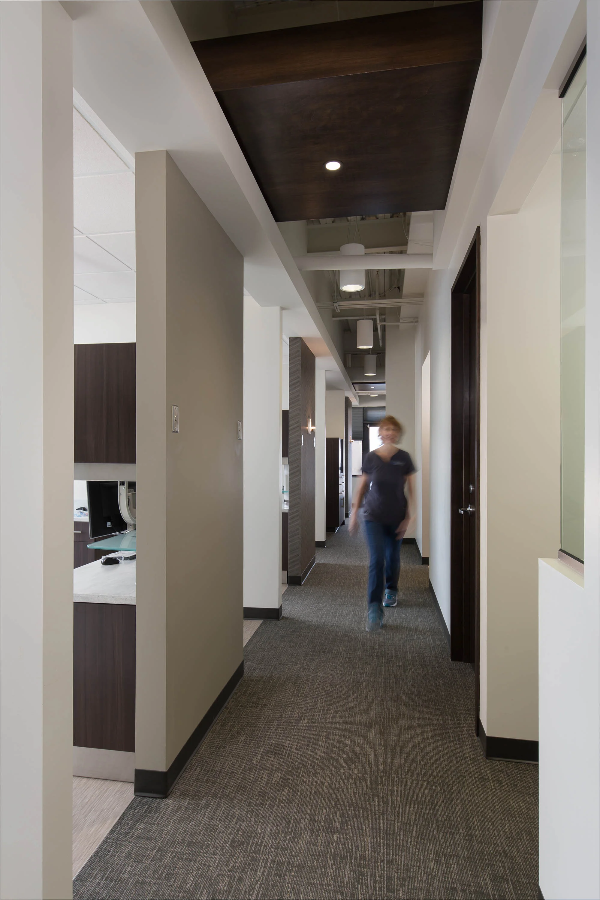
Affinity Contemporary Dentistry’s entirely new office was designed with a unique concept in mind. Affinity Contemporary Dentistry desired a completely new space that felt clean and dignified without feeling clinical. JPC used wood tones and rich neutral colors, such as greys, deep browns, and varying shades of blue, and a variety of patterns and textures, including herringbone, to give the office a polished and sophisticated feel. Branding accents and pops of color were placed throughout the space to emphasize and reinforce the company’s branding. Affinity Contemporary Dentistry’s office is now a polished and comfortable space for both staff and visitors.
Cleary O’Farrell Photography


