Assurance
44,000 sf | seattle, waHIGH LEVEL DESIGN SHOWCASING SPECTACULAR VIEWS.
Our client had already leased the space and hired the GC when JPC was hired, which was a unique experience for our team. Initially we felt like they had leased too much square footage for the program we developed, but the extra space allowed for some nice breathing room between open and shared spaces and aided in maintaining a high level of visibility through the office.
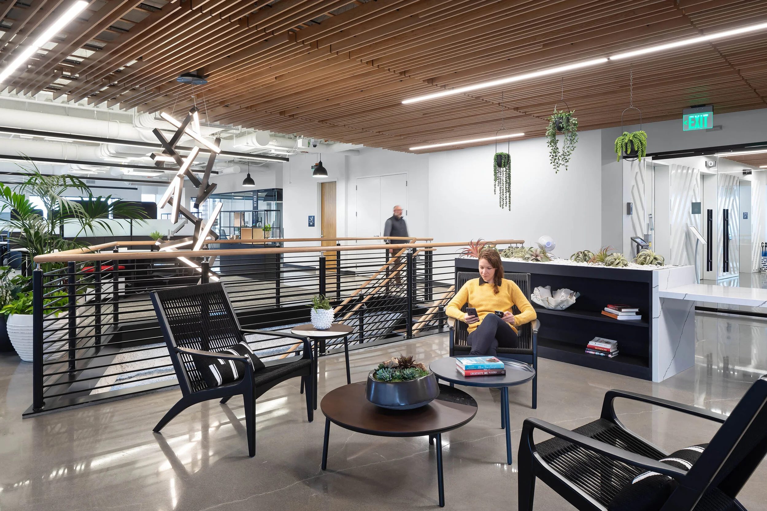
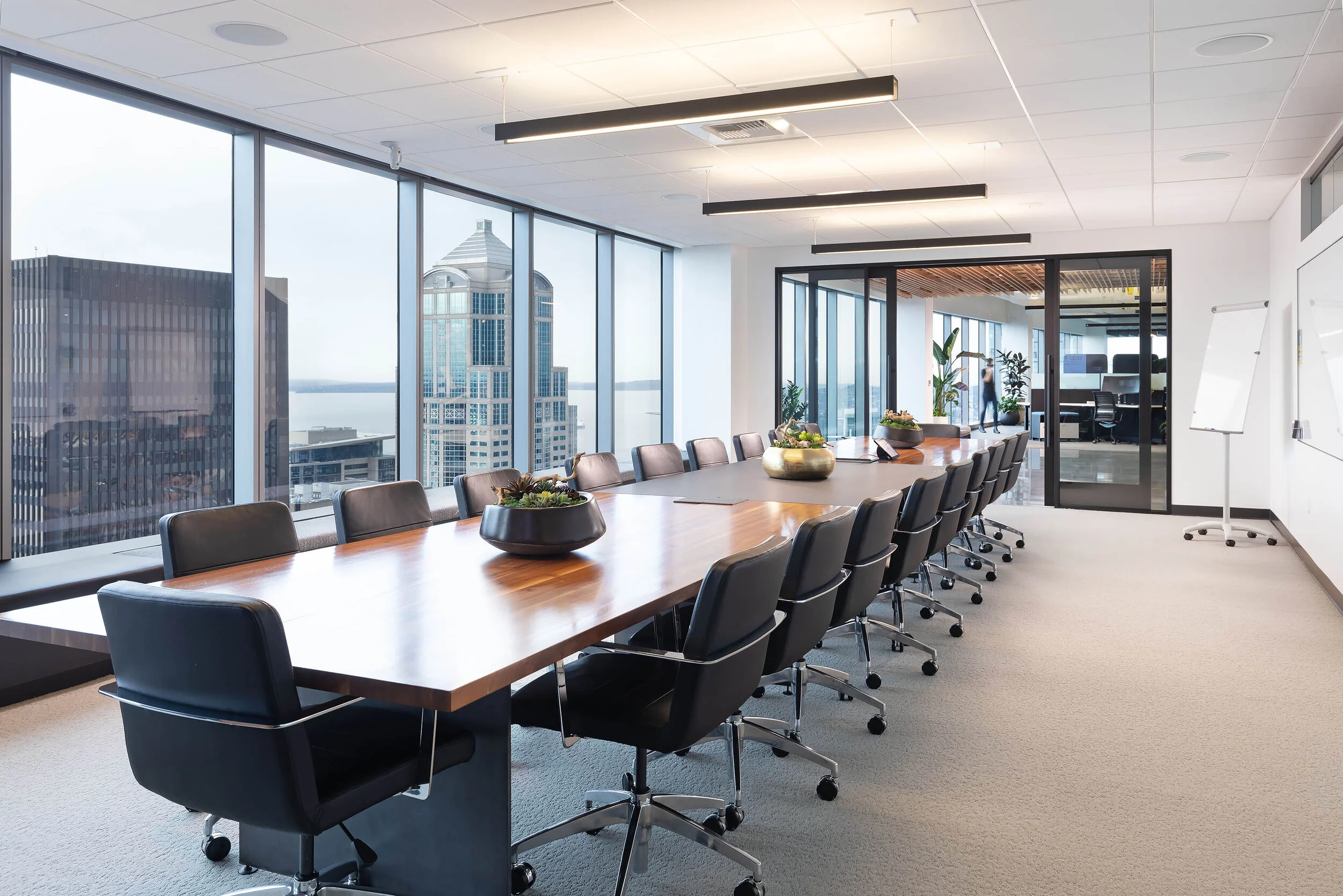
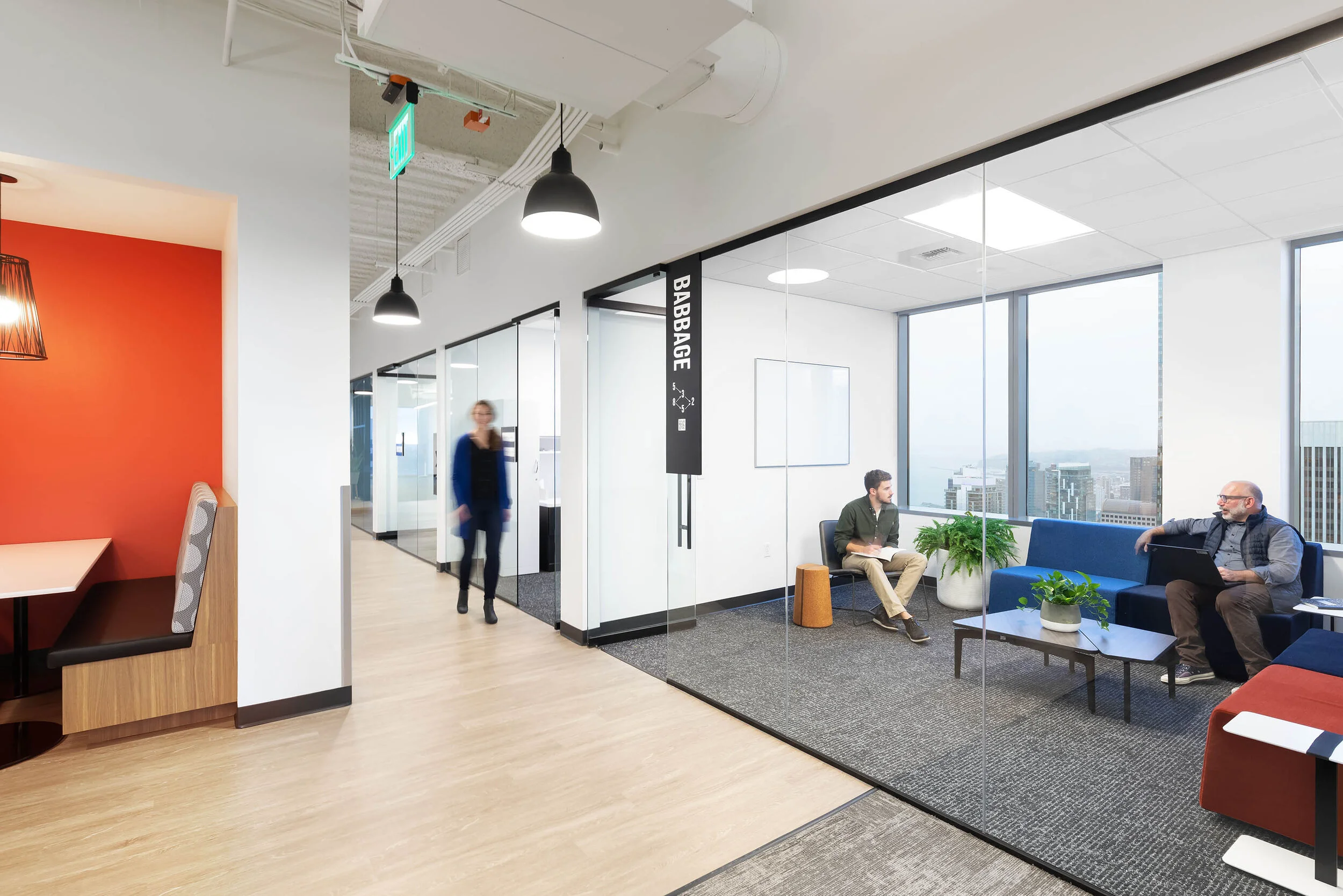
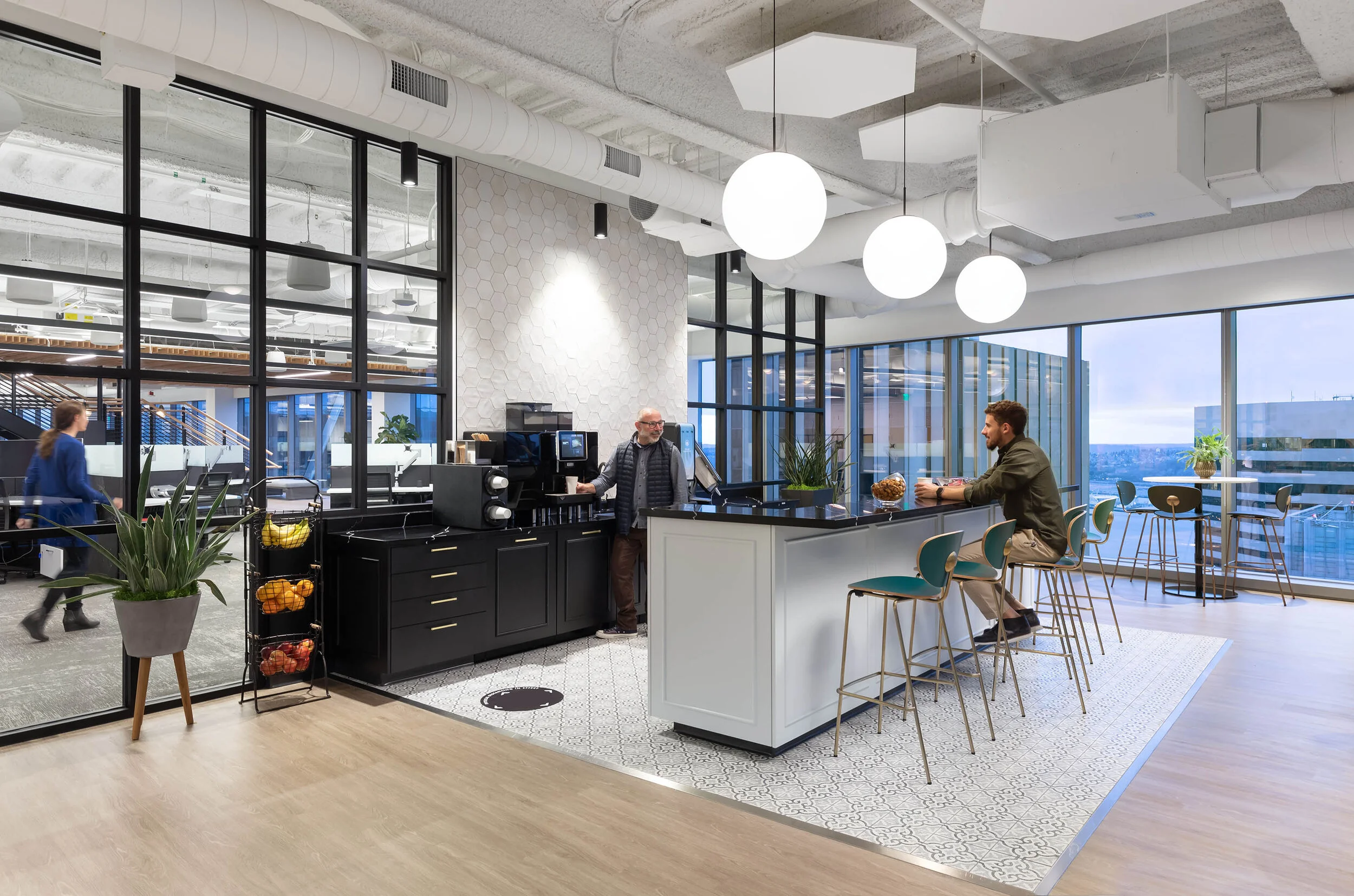
One of the key drivers of all design decisions for the project were the spectacular views, as the space is located on the top two floors of Madison Centre and we had largely uninterrupted 360 degree views. Our client wanted a high level of transparency from most locations so you could take the views in.
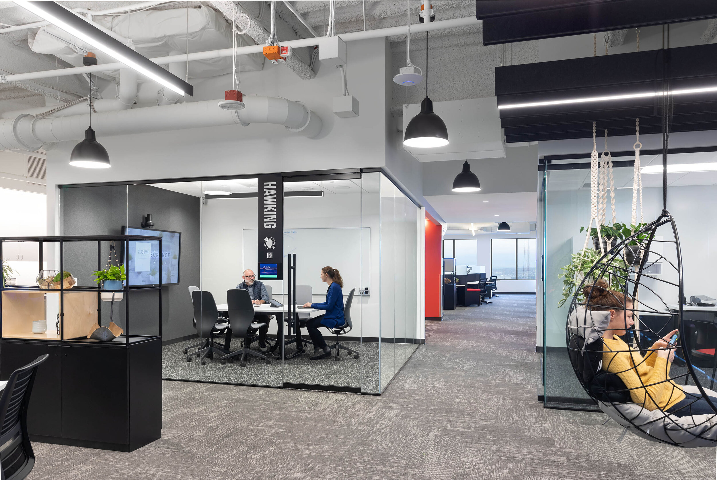
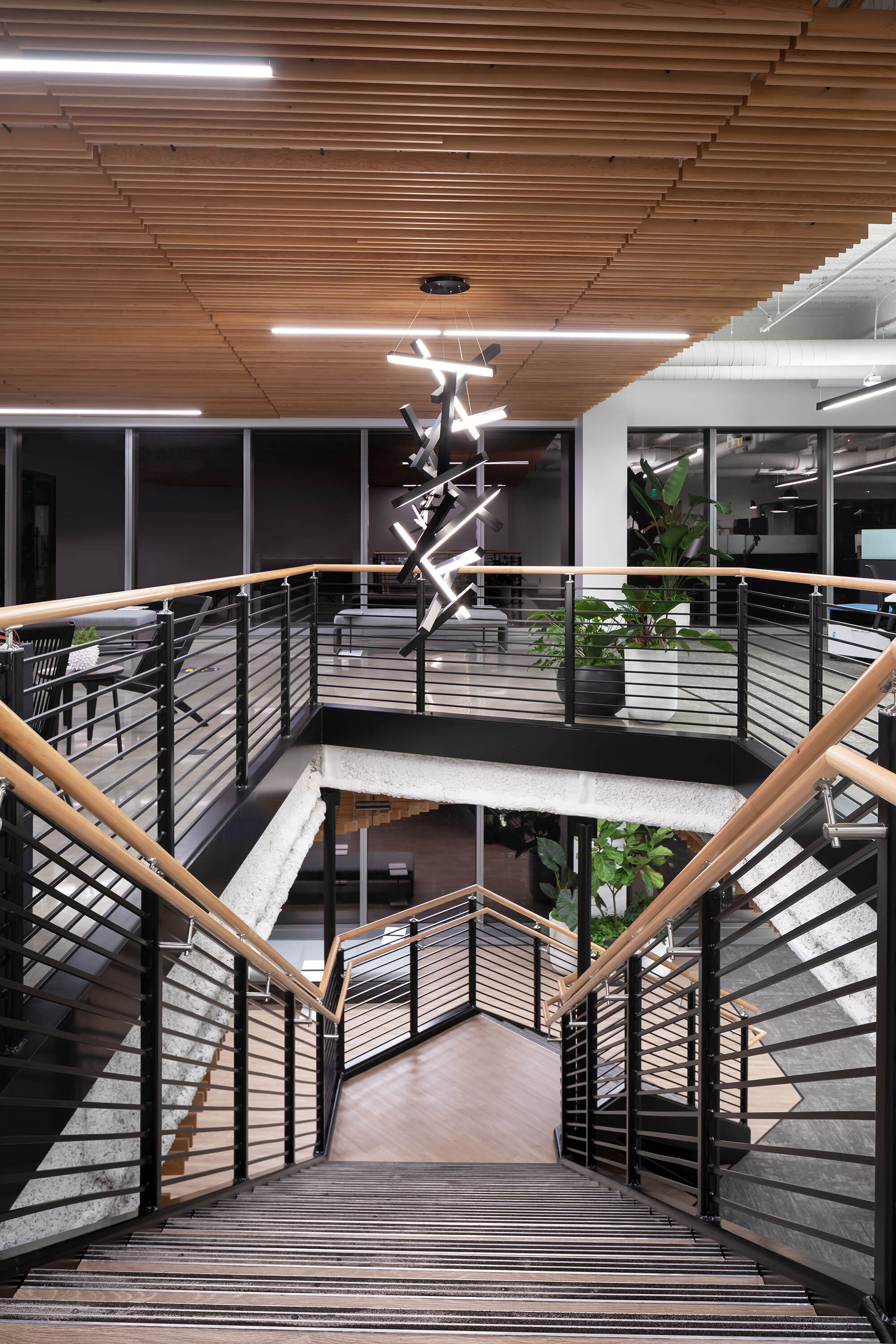
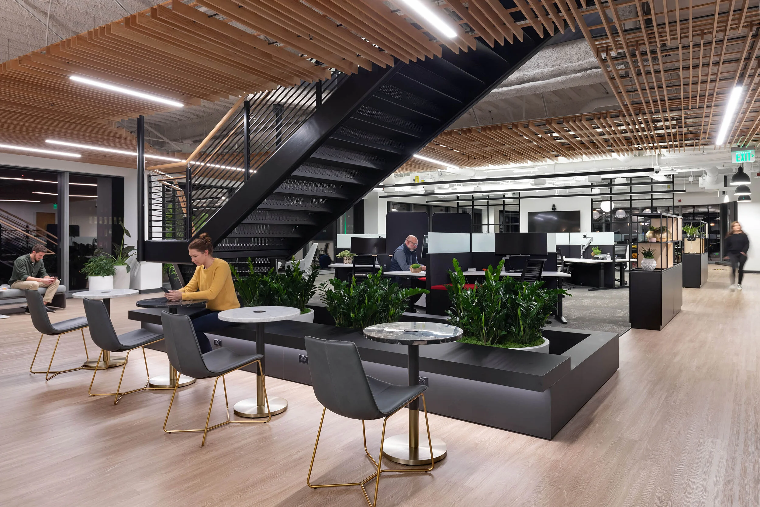
Aesthetically, our client wanted a modern-feeling office that was relatively neutral while using brand colors strategically. We used a monochromatic black and white scheme and a variety of carpets to create actual and visual texture. They also placed a high level of importance on biophilia, so we used Spacestor dividers as a way to incorporate visual privacy and greenery into the space. An employee provided macramé plant hangers that we used throughout - getting staff involved in the design process added to the importance of the cultural connection they have. Functionally, it was important to create a variety of ways/places for people to collaborate or have quiet separation depending on individual need. This had been a limiting factor in their existing office. With the additional square footage we were able to create a wide variety of ways for staff to engage.
The client was extremely happy with the final space. It reflects their evolution as an organization that started as a bare bones "start-up" to now becoming a significant player in their field of expertise.
They take great pride in their journey and their culture. They now have a space that will further support the innovation and creativity they strive for for their staff and their clients.
Access to daylight and outdoor views were important to the project and the introduction of plants throughout the space will certainly help with air quality. We also updated all the fixtures/faucets to touchless ones once we started construction of the project during COVID-19. The client has used graphics throughout the space to address distancing and protocols for health and safety. They also tweaked their final workstation layout to include some additional screening separation at each desk. These items can be removed easily in the future should they decided they aren't needed.
cleary o'farrell Photography
